This is my fisrt image that was made mainly by Adobe Fireworks CS3 ( i realize that this software is easier to use than Photoshop and i am sure that you will love it at first try. Actually, i am not really like Photoshop at all, but i still use it as my secondary software to edit image. Hehe ). In this entry i will show you the process of making this image.
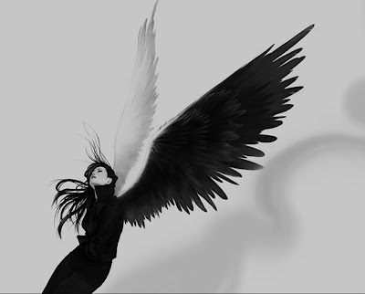
This is my stock image which is capture when i was making film for DIM 1 Project. I intend to use this image to develop the ideas

Fisrt, i went through the Internet and find ideas for my project, i suft though many art website ( You can find them in My favourite link) and see other artists project. I looked carefully and chose what is the best for my photo, i also keep in mind what do i already have for my project. I recommended this site
"Web Designer Wall"
After this stage, i already have the ideas and i started to search images for my project. I usually visit these website
Flickr,
Customize,
Deviant Art. These website always have the image i need :D. In case there is no image i need in these website, i also use Google Search as other internet source.
My ideas is to create a picture that show a dark angel with bog black wings and long weapon in hand. He is standing in the roof of the highest building and looking for enemies :)). So all i need is the image of back wings, feather, city background (top down view) and a long weapon. This is all i had found
 Black wing
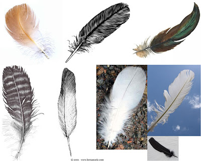 Feathers
 Long weapon
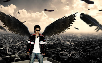
The next stage is to combine those image into 1! I first try to cut out the wing and found that it was to small for my body so i duplicated it and make a larger wing. Then i cut out all of the feathers and make it black to suite with my dark theme, then i fill my photo with feathers fly around to make it look like in motion. I also created Depth of Field effect. The photo is now become this one
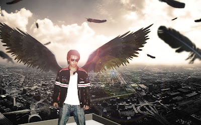
Hix, this look so ugly so i decided to add some light into the picture, right behind my head ( I made this light by using Flare tool in Photoshop) and make the background glowing more. And...
Final work
 Thanks for watching my work :D


